

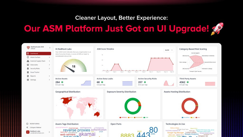
We’ve rolled out a series of updates to the platform quietly, and deliberately. Not because someone filled out a feedback form. Over time, even the best tools start to pick up a little clutter. Components get added piece by piece, features get stacked in, and eventually, the UI starts feeling more like a patchwork than a product. We saw that happening and we didn’t want to wait until it became a problem. So we looked at the way people actually use the platform, and asked ourselves a simple question: Can this be easier? The answer was yes, so we got to work.
The goal? Give you an upgraded experience without changing how you work. If you log in regularly, this version should just feel better. More fluid. The result? A cleaner interface, a smoother flow, and a platform that does what it’s supposed to help you get things done, without slowing you down.
So, what exactly changed? Let’s take a look!

What’s New in the UI?
Here’s a breakdown of what’s been added, moved, or improved, all in one go:
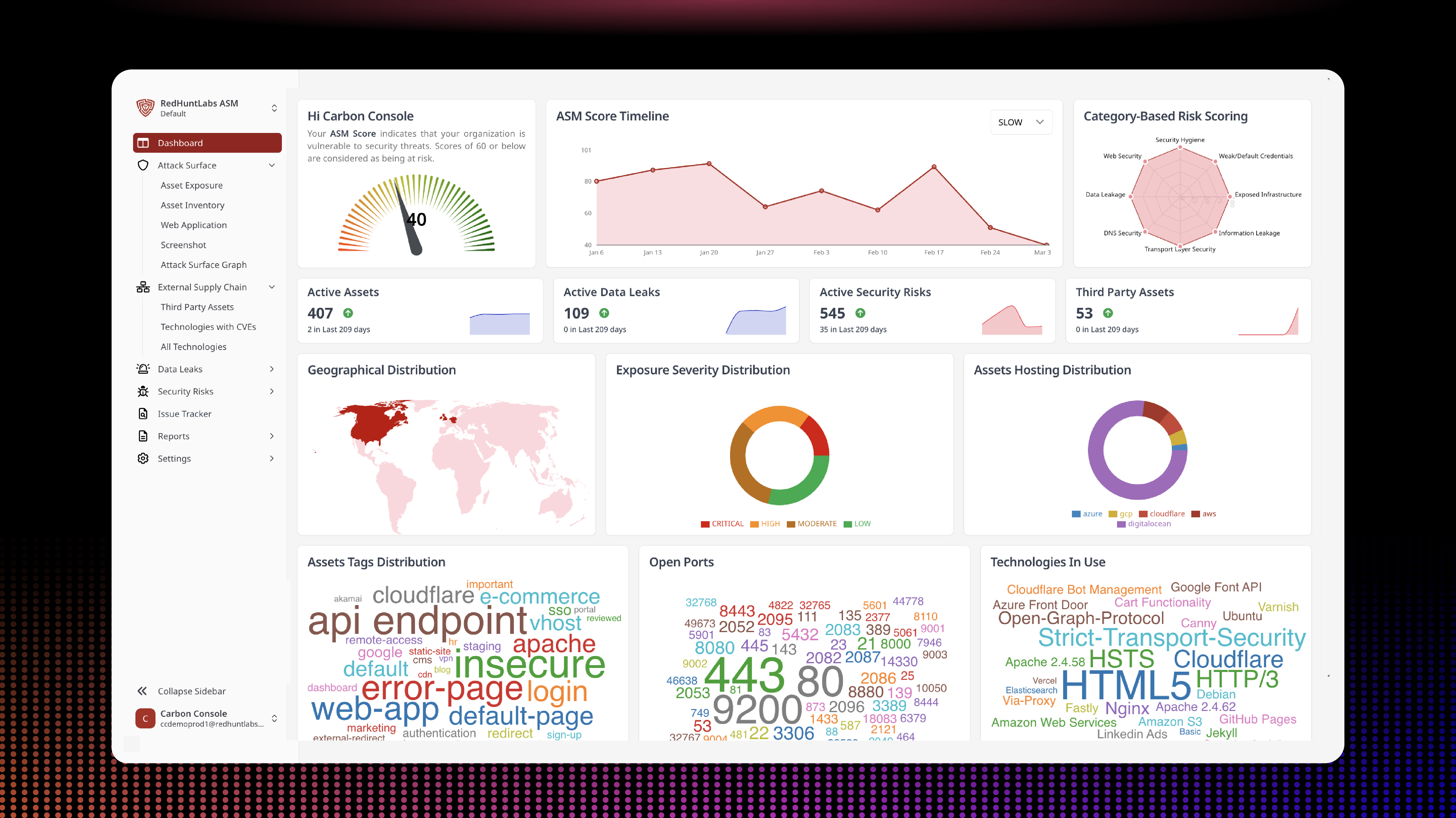
→ Clean UI and Refreshed Dashboard Components
The dashboard you see when you log in now has more breathing room, better visual hierarchy, and a more focused layout. It’s less about pretty widgets and more about quickly understanding what’s happening at a glance. We’ve merged scattered insights directly into the dashboard, so you don’t have to jump between tabs to understand what matters. It’s one place to land, and one place to act from.
Each new feature added a little bit of clutter. We’ve cleaned it up. Components now behave the same way across pages. Things are aligned, spaced properly, and just look more intentional. You’ll notice it when you jump between sections: buttons in the right places, fewer distractions, better legibility.


→ Category-Wise Scoring
Your overall score used to be this one big number, which was fine until you needed to figure out what was affecting it. Now, scores are broken down by categories.
No more guessing. You can see exactly which areas are strong, which ones need work, and what’s contributing most to your security posture. This isn’t about showing off more data, it’s about showing the right data, so you can act faster without clicking through a dozen things.


→ New Place for Profile
We’ve moved your profile section to a more intuitive location, bottom-left of the sidebar, so it’s always right where your eyes naturally land when you want to log out, switch accounts, or just check which workspace you’re in. No more digging through hidden menus. It’s quick, visible, and exactly where it should be.

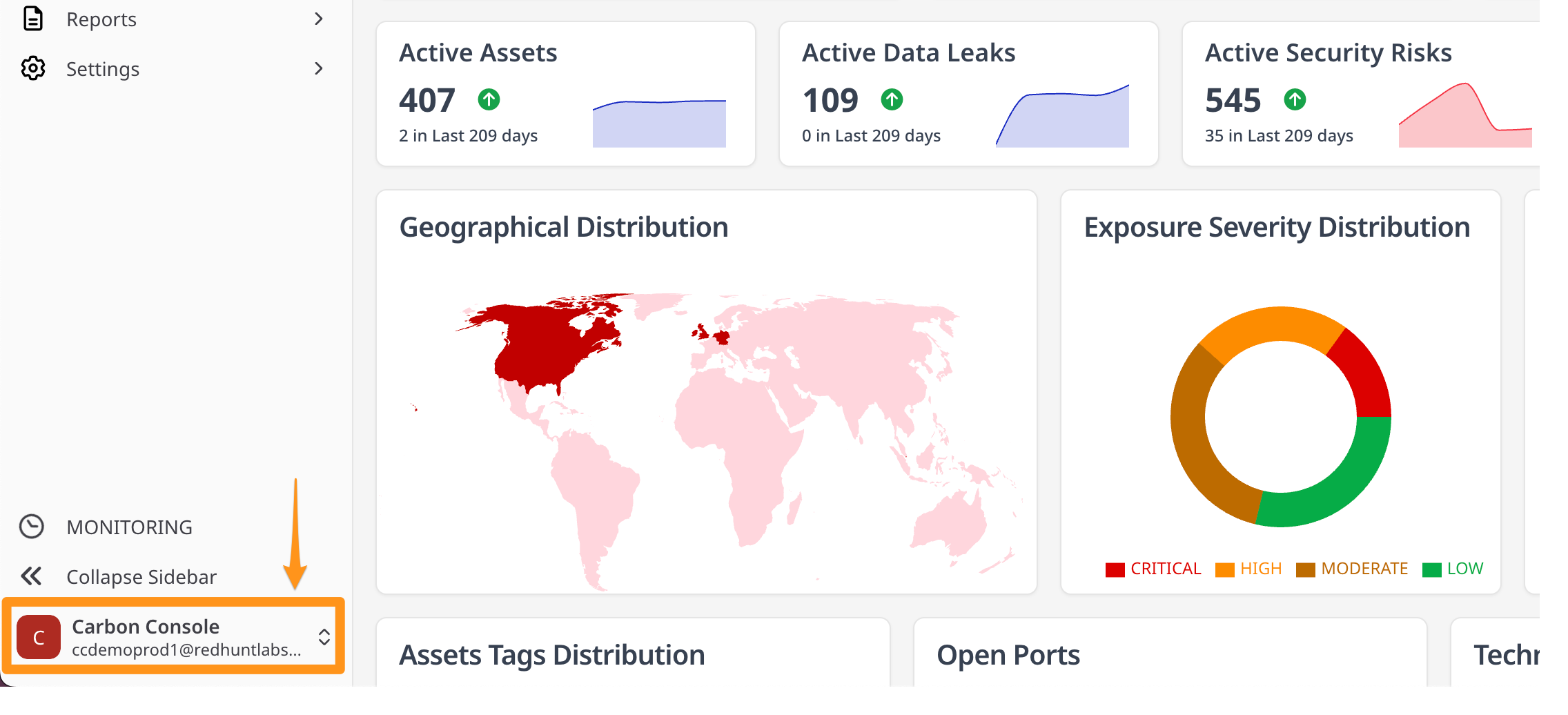
→ Asset Grouping, Made Effortless
Asset Group selection now lives at the top of the dashboard, right next to the platform name. This change isn’t just about aesthetics; it’s about speed and clarity. You can now switch between default and other groups you might’ve created, without jumping through hoops. It’s easier to manage different slices of your attack surface, all from a single dropdown, and it stays consistent no matter where you are in the platform.


→ More List Items per Page
This one sounds small, but it brings massive value to the platform. We bumped the default list size to 100 items on most pages. No more endless clicking through “Page 1 of 12” just to scan through your data. You get a bigger slice of the picture at once. It’s especially useful when you’re searching for trends, doing triage, or working through a backlog.


Down to the Details: A Closer Look at the New Interface
This upgrade goes beyond a surface-level refresh. We’ve rethought how the platform looks, feels, and flows, so that every part of it works better for you. Here’s a closer look at the changes:
→ A Unified, Modern Design with Shadcn
We’ve adopted Shadcn-based components across the platform to create a consistent and unified interface. Whether you’re looking at a settings page or deep inside an asset group, everything now follows the same visual language: clean, minimal, and focused.


→ Improved Typography for Easier Reading
Fonts aren’t just aesthetic, they affect how long you can stay focused. We’ve made deliberate adjustments to typography: line height, spacing, and font weights, so that reading through data, settings, or insights feels more natural and less tiring.
→ A Calmer, More Neutral Color Palette
We’ve refreshed the platform’s colors with a neutral base and a single accent tone. This helps reduce visual noise and brings more clarity to key actions and elements, without overwhelming you with too many competing colors.
→ Denser Data Views That Don’t Feel Overwhelming
We’ve increased the information density across tables and lists, without making things feel cluttered. Now, you can see more at once, skim faster, and make sense of complex data with fewer clicks and scrolls.
→ Built with Tailwind CSS for Visual Consistency
Under the hood, the platform is now powered by Tailwind CSS. What this means for you: more consistent layouts, quicker fixes, and a visually cleaner interface that feels the same wherever you are in the platform.

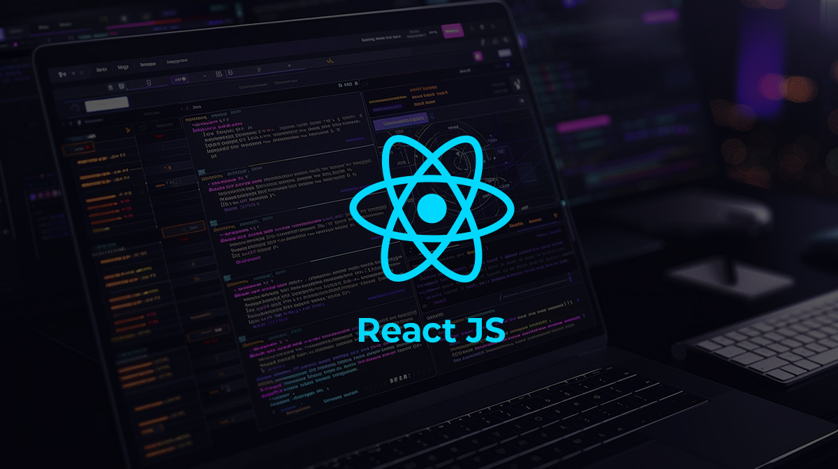
→ Upgraded to the Latest Version of React
We’ve updated the tech stack to the latest React version. While this isn’t something you’ll directly see, it means better performance, stronger security, and smoother handling of interactions across the board.

Why We Did This (Spoiler: Not Because of Feedback)
Let’s not sugarcoat this: we didn’t wait around for feedback. In fact, we got many compliments earlier saying that ours is a very clean UI and doesn’t focuses on a fancy dashboard, but rather focuses on giving actionable results. However, we ourselves saw the rough edges. We knew some parts felt disjointed. So instead of waiting, we fixed them.
The design changes weren’t made to impress anyone on a demo call. They’re not about showing off, they’re about getting out of your way.
What Hasn’t Changed
The core functionality remains untouched. Your workflows haven’t changed. We didn’t rearrange things just for the sake of it. So if you’re already used to the platform, this will feel like an upgrade, not a reset.
What’s Next? We’re not calling this “Version 2.0” or anything dramatic. This is just one of many updates aimed at making your day-to-day smoother. And we’ll keep going.
Ready to See the Changes for Yourself?
Whether you’ve been with us for a while or you’re just getting started, the new platform experience is designed to help you work smarter and faster. We invite you to take a quick tour and explore the improvements firsthand. Dive in and discover how the cleaner layout, improved navigation, and organized asset grouping can simplify your daily tasks. We’re confident you’ll notice the difference right away.
Now is the perfect time to get acquainted with the platform. Our refreshed interface makes it easier than ever to get started and stay on top of what matters. Take a tour and experience the updates in action. If you have any questions or feedback, we’re here to help every step of the way.
.
Want a Closer Look? Book a demo and we’ll show you
what’s new, and how it can make your experience better!
.