Say Hello to Our New Logo
New Logo – Same Mission
Today marks an exciting new day for RedHunt Labs. We are officially launching a new brand identity for the company, positioning us more accurately as the team we’ve evolved and grown to be.
While we have a new modernized and simplified logo to have a fresh look, our new brand identity simply reflects who we are today and our focus on helping clients secure their data and assets.
Despite the new look and feel, we are still the company we’ve always been. The only difference is we now have a top-class brand identity to match our offering.
Here is what we started with:

This logo was designed before the operations started and hence it was very simplistic in nature. With 360 degrees Hyper Growth, we believed it’s time for a change. Hence, we have refreshed our logo to reflect who we are today and to symbolize our future.
The theme behind the New Logo:
We are an information security company that offers SaaS-based Attack Surface Management (ASM) product, NVADR which helps enterprises discover, track and secure their exposed Assets continuously. Hence, we kept the following pointers in mind while working on the new branding:
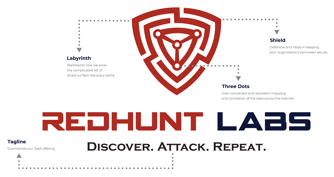
- Shield – This represents the Information Security side of our offering which helps in keeping your organization’s perimeter secure.
- Labyrinth – Represents how we are solving the complicated set of attack surface discovery paths to find our customers’ data across the internet and making it simple for them (the customers) to get visibility
- Three Dots – They are inter-connected and represent mapping and correlation of the data across the internet.
- Red Color – Represent the attacker’s mindset and the approach of truly mimicking an external attacker.
- Blue Color – Represent a defensive mindset and ultimately make the internet a safer place.
- Discover. Attack. Repeat. – Summarizes our SaaS offering, where we continuously discover the ever-expanding attack surface for organizations, find exposures and repeat it to make sure they are well-covered round the year.
Fonts Used:


Spy Agency is a modern and futuristic font which reflects our approach and willingness to work on cutting edge technology and security challenges.
Color Codes Used
#AE2B22
#0E173A
Final Logo Concept:

Final Logo:

With this new identity, we’re going to have a fresh look, while sticking to our ethos and mission, and we’re going to continue helping our clients maintain holistic cybersecurity of their digital footprint, globally, and help them reduce their ever-evolving attack surface.
Press Kit Download and More Information
What do you think about the new logo? Please share your thoughts at brand@redhuntlabs.com.

